A New Look for the Yoga Fellowship...
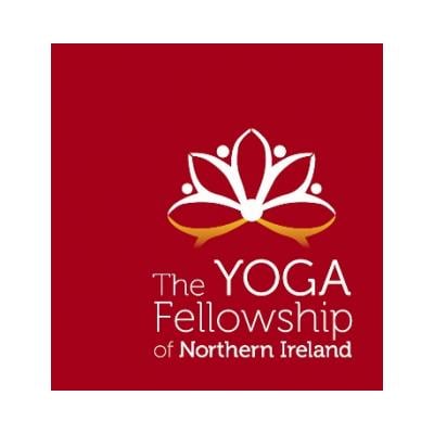
Several months ago YFNI's Committee thought it was time to refresh our outlook. The starting point to reflect this externally was a fresher logo, something simple yet eye-catching.
Briefs were sent to a range of graphic designers asking for the lotus flower to be maintained as a central theme but to embrace the fact that as an organisation YFNI is changing and moving forward into the 21st century.
The designer chosen was Gabriel Carbone from Buenos Aires, Argentina and we hope you’ll agree he has brought a life and an energy to our new look, perhaps inspired by his South American homeland and culture. We believe he has done a great job and we hope you do so too.
To quote Gabriel, the logo is ‘modern, simple, clean and easy to both recognise and memorise’.
If you look closely, our new logo shows the abstraction of a lotus flower, but look closer still and you will see the hidden image: four people holding hands in a beautifully unified series of sunbursts! At the base of the flower is the reflection of the two outer people as if standing over a pool of water.
The colours chosen by Gabriel, in his words ‘represent the spiritual and corporal energy of the human being’ and the font is simple, modern and light ‘its function being to give oxygen to the logo and enable it not to be too heavy or strong’.
From a yoga perspective the logo change represents a new chapter for the Fellowship. The use of red is reflective of the base chakra...signifying getting back to our roots: promoting yoga, supporting our members and training teachers.
For more information about YFNI log onto www.yfni.co.uk.
YFNI -
A not-for-profit voluntary organisation supporting, promoting and training yoga in Northern Ireland
Ends

